Content
Keep it SIMPLE.
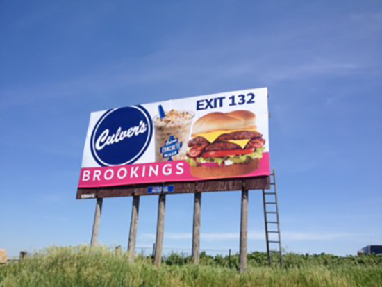
Prospects are zipping by at 55+ M.P.H. They have only 5-10 seconds to notice, become engaged by and process your message. Don’t make it difficult by cramming your billboard with too much stuff. Try to keep your copy length to 7 words or less. The fewer the words, the greater the chance they’ll understand, retain and recall your message.
Use:
- A compelling image / photo
- A unique, benefit laden, emotionally charged headline
- Your name / logo / contact info
Be bold, courageous, and daring! Bear in mind… Absolutely NO ONE will remember DULL. Follow these billboard design rules but break all the rest in pursuit of the memorable! Explore every possible concept, no matter how crazy it initially seems. Nutty ideas often develop into unique and highly memorable outdoor campaigns.

Clarity
Use large, simple fonts.
Large fonts allow reading at greater distances, giving the viewer more time to process your message. When designing billboards, minimum type size should be 18″ tall, with 3′ and taller being optimal. Humongous type not only aids readability but adds life to your message.
Thin and/or elaborate script fonts are hard to read (and often invisible) at long distances. Use thick strokes and simple styles to increase legibility at distances greater than 1,000 feet. Keep ample space between individual letters to avoid blurring, and avoid ALL CAPS, they’re less legible, too. Your billboard has to be read to persuade.
Colors
Use High Contrasting Colors.
Bold, highly contrasting colors help get you noticed. Soft, mellow pastels may work fine in slick magazines but they don’t do well in outdoor advertising. When it comes to color and designing billboards, bold is definitely beautiful.
Be sure that the colors contrast in an appealing way. Bright red and green may offset one another, but they can hurt your eyes and do not contrast in an appealing way. Take a look as some of the examples below.


